Responsive email design is definitely one of the must-have features when choosing the right email vendor. There are many email marketers still sending out emails that are only (or best) viewed from on a computer, yet statistics show that, in 2013, approximately 51% of persons checked their emails on mobile devices. If you don’t adjust your strategy accordingly so that potential viewers can read your email content from a phone or tablet, then you’ll be leaving a lot of money on the table.
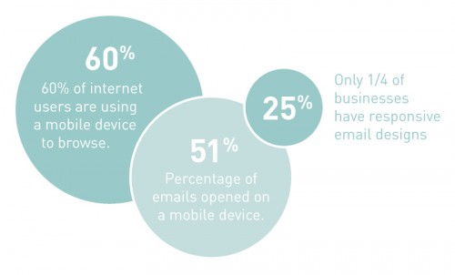
Source: Atomic Object
Choosing a platform that offers responsive email design isn’t enough to maximize your email potential. Since you don’t know the device customers are using or what they’re doing when looking at your emails, you have to take all angles into consideration and create the perfect layout and message for all potential situations.
Always keep these tips in mind to ensure you’re getting the most out of your responsive emails.
Prioritize necessary content, eliminate everything else
While it’s not true that all persons viewing email on mobile are ‘on the go’, you do want to keep emails simple and easy-to-scan. Reading emails nowadays is considered a time-suck and the last thing you want to do is offer up an email that doesn’t get read at all just because of its intimidating length.
Decide on the ideal action you want email viewers to take, determine the shortest, most effective path to that action. If you want to (or must) include a lot of different content, ensure that the primary offer or best information is at the top to capture viewers’ attention the moment they open their emails.
When planning content layout using a responsive template, keep in mind that templates which offer multiple columns on the web, often split on a mobile screen, so content in the right column(s) won’t be readily viewable.
Make images optional
Images are awesome and they get a lot more attention online than text. Unfortunately some email providers and mobile applications don’t load images readily. Some users may also choose to turn off image loading to save on data or bandwidth. Your emails, therefore, shouldn’t rely on images to tell the story.
Image that are included shouldn’t be too large, as these take longer to load on mobile. If images have text, ensure that the text is large enough to be visible on smaller screens. Also make sure that any text included on images is either not important or mandatory, or repeated in text in the email.
Use large buttons and calls-to-action
As mentioned above, sometimes readers don’t have a lot of time to view emails, but that doesn’t mean they won’t act if something catches their eye. Since mobile screens use tap functionality, as opposed to mouse navigation and clicking, it’s important to make buttons and CTAs large enough to be tapped with a finger. Using buttons, rather than plain text CTAs, is also recommended since these are more likely to get attention and clicks.
As with any other form of marketing, giving the user too many options can often result in a decision paralysis, where they are uncertain of what to choose and end up choosing none. For frictionless results, limit choices and reduce or eliminate social media and other unnecessary buttons in emails.
Test out your email on different screens
Devices display things differently. This means that even if you send the same email to everyone on your list, someone viewing it on an iPhone might see a different layout than someone viewing it on their Samsung smartphone.
Luckily, you can use the simulation feature offered through some email marketing software to view the email on different devices. Software that offers measurement capabilities can tell you what devices are mostly used to view your email so you can narrow your testing to the ones used most. If anything is off, you can adjust the email accordingly.
Of course, keeping things simple throughout the email is the best way to ensure that you have few changes to make at this stage.
View emails on mobile screen while creating. (Source: GetResponse)
Ensure links lead to mobile-friendly pages
This is probably the most overlooked factor in many email marketing campaigns, mostly because it’s not directly related to the email itself. If your CTAs within the email take users to a page that is not optimized for mobile viewing and they leave for that reason, you’ve just wasted a lot of time crafting the perfect email for nothing. There’s a small chance that, if your offer is appealing enough, they may simply wait to get to a computer to complete the offer, but there’s no need to give them more work than necessary.
If the webpage you want to send viewers to is not responsive, then build a responsive landing page. It’s also important to keep the message and branding consistent to create a continuous flow for the reader. GetResponse is one email marketing software that offers an all-in-one solution for responsive email design and landing page creation so you can use similar templates and images across the board.
There you have it! Implementing a Responsive email design is definitely a step in the right direction, but if you’re not considering the details of your email and how it will be received by each of your potential viewers, you risk losing out. Take these factors into consideration for your next email marketing campaign.