Logo design has taken an interesting shift from the past few years. We’ll start off by saying you should never blindly follow trends, but being aware of them can help you strike that perfect balance for creating a brand identity. Are the curious kind who is always in a lookout for latest logo design trends? So, today we’re going to reveal some best predictions for logo design trends this 2016.
This guide will keep you informed about the current trends, and inspire your next logo design project. Do you think these predictions will be come true? If you have any opinion so, please share with us via comments section below. You may want to take a look at the following related articles: Fingerprint Logo Design Examples, Real Estate Brochure Design Inspiration and WordPress Flat Design Themes.
1. Flat Design
A logo is a difficult piece of work to perfect though, not only does it need to stand the test of time. Using the flat design style for your logo is great for helping to craft a clean, minimalist and beautifully simple aesthetic.
2. Calligraphy
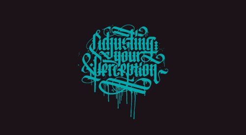
Calligraphy is refined, high-end, and fancy. Calligraphic logos are ideal for designers, boutiques, photographers, perfumeries, and lifestyle writers. In 2016, the trick with this style will be to make it identifiable and individual.
3. Overlapping Elements
Yet another trend that’s all set to rock the world in 2016 is overlapping trend. Using an overlap technique makes it effortless to add depth and motion to your logo. This allows your logo to stand out and capture the attention of your target market. Using an overlapping technique can make a great difference.
4. Perspective Logo Trend
A logo is very important for your business, and more important than a logo is a good logo. 2016 perspective logo design has been refreshed through a new use of shape and color. To take it a step further, animations can also be added to web-based logos.
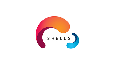
5. Negative Space Logo Trend
Negative space is an inspiring field in the design world. Negative space is expected to go strong this 2016. A good designer will always make a good use of negative space. It’s a great way to capture a customers attention, and make them think twice.
